The brand needed a distinctive visual identity that would present the fields of nutrition, healthy eating, and balanced lifestyle habits in a clean and contemporary way. The goal was to create a memorable logo that could be seamlessly applied across both digital and print materials while reflecting professionalism, expertise, and approachability.
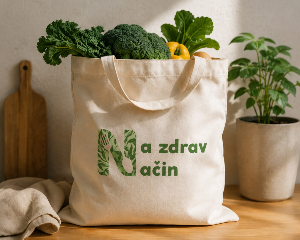
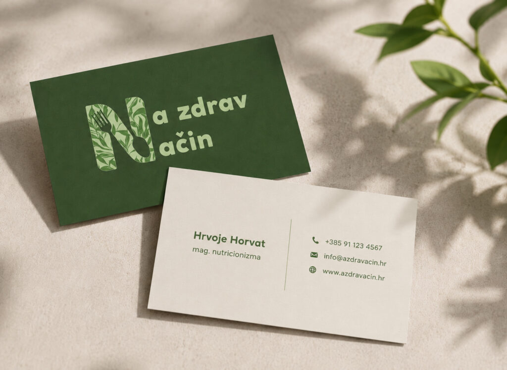
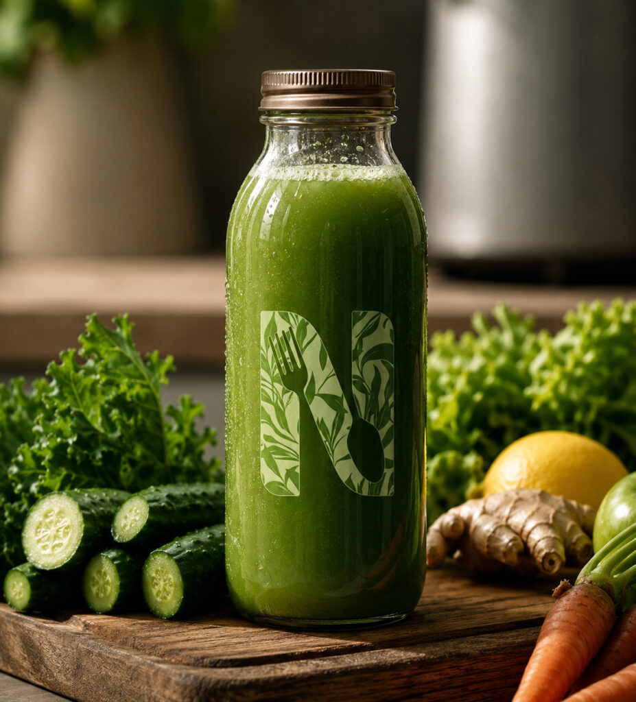
The logo concept is based on a stylized letter N, representing the initial of the two words that make up the brand name. By combining natural botanical elements with cutlery within the letterform, the design visually communicates the brand's core message: fostering a healthy relationship with food as the foundation of a better quality of life. The green color palette further emphasizes freshness, balance, and a strong connection to nature.
The brand needed a distinctive visual identity that would present the fields of nutrition, healthy eating, and balanced lifestyle habits in a clean and contemporary way. The goal was to create a memorable logo that could be seamlessly applied across both digital and print materials while reflecting professionalism, expertise, and approachability.
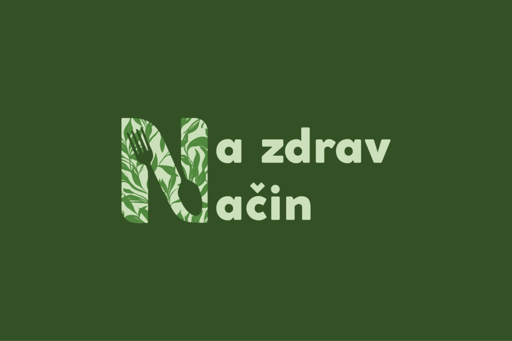
The logo concept is based on a stylized letter N, representing the initial of the two words that make up the brand name. By combining natural botanical elements with cutlery within the letterform, the design visually communicates the brand's core message: fostering a healthy relationship with food as the foundation of a better quality of life. The green color palette further emphasizes freshness, balance, and a strong connection to nature.